

While at River Island I lead a major initiative centred around reducing the amount of customer drop-off at critical “moments of truth” in the shopping journey. One key area I identified was the discount code redemption experience.
Challenge
The current experience lacked clarity. Customers would submit codes without receiving confirmation leading them to not knowing a code hasn't be applied.
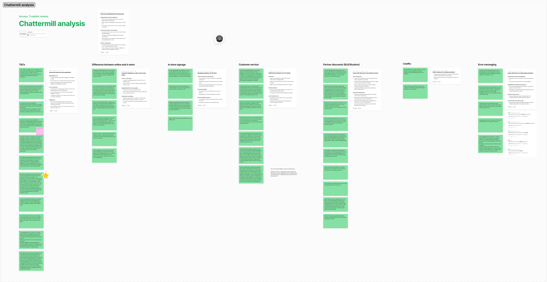
One important business rule was that only one code could be used per order, which wasn't being clearly communicated to customers. We could also see from contact centre data and Chattermill feedback that a lot customers were ordering items thinking they had a discount code applied only to realise that no discount was added and were therefore paying more.
Making a start
To get the business listening to this we needed to collate as much data as possible whilst also painting a solid picture of what was going wrong.
Process
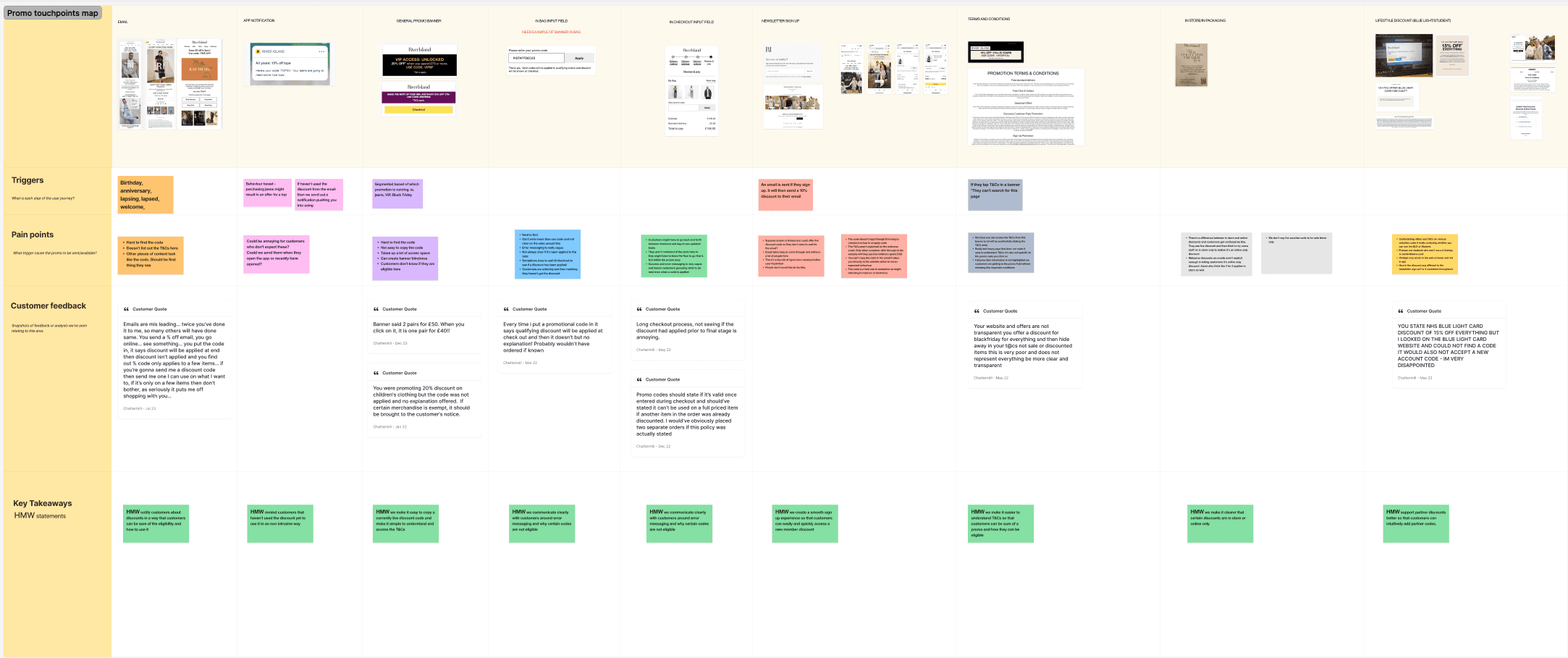
I started with mapping the customer journey which turned into more of a user story map as there were multiple ways into redeeming a code. There was also so many points in which a customers might interact or see a code on the website so we need to capture all of this.
Once this was mapped we added in real customers insights to back up each touchpoint with a real customer problem. We were collecting this data through Chattermill, our customer insights tool, and using previous customer interviews to map quotes that were previously said about anything discount code related.
When a discount code was live, there was a noticeable drop in conversion. This validated our initial hunch, something was going wrong during code redemption
Allowing customers to more confidently add discount codes whilst allowing better discoverability of codes will lead to less drop off on the funnel
Final Designs
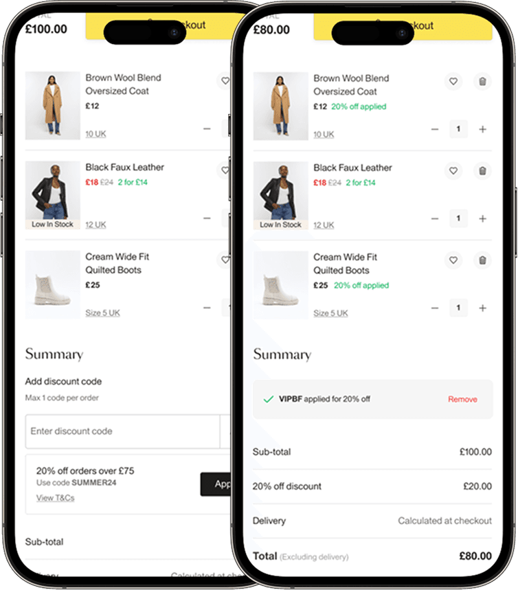
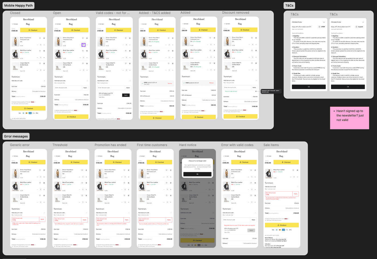
The final designs resonated strongly with users during testing. Participants consistently reported that the new flow made it clear when a discount code had been applied successfully.
They especially appreciated how easy it was to add or remove a code, with many calling out the redesigned experience as straightforward.
One key win was the new discount code banner placed just below the input field gave users immediate visual confirmation and helped to guide them through the process without confusion.
Overall, the improvements not only made the experience more intuitive, but also gave customers a greater sense of control and confidence at checkout.